CSSでのアニメーション作成の方法
アニメーション(回転)のコード例
下記のコードはclass: Rotate-targetの要素を回転させるものである。
@media (prefers-reduced-motion: no-preference) {
	.Rotate-target {
		animation: spin infinite 15s linear;
	}
}

@keyframes spin {
	from {
		transform: rotate(0deg);
	}
	to {
		transform: rotate(360deg);
	}
}
各コードの説明
これは、spinで書かれたコードの動作を15sで実行し、linear線形動作をする。
@media (prefers-reduced-motion: no-preference) {
    .Rotate-target {
      animation: spin infinite 15s linear;
    }
}これは、rotateで回転動作を指定している。
()のなかはdeg(度数法)で回転のスタートと終了を記述している。
@keyframes spin {
   from {
     transform: rotate(0deg);
   }
   to {
     transform: rotate(360deg);
  }
}
アニメーションのcurve
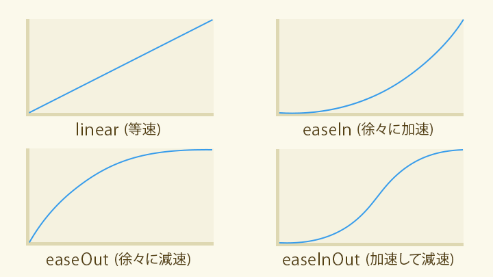
アニメーションはanimation-timing-functionを使用することでアニメーションの動きをカーブすることが出来る。
引用:

CSSイージングのお手本 - ease-out, ease-in, linearの使い分け - ICS MEDIA
イージングとは「動きの加減速」を示す用語で、アニメーションにおいては動きの「性格」を表すものです。適切なイージングを設定することで、演出としての印象がかわります。UI体験をデザインするうえでイージングは欠かせない要素です。
@media (prefers-reduced-motion: no-preference) {
	.float {
		animation-name: float;
		animation-duration: 5s;
		animation-iteration-count: infinite;
		animation-fill-mode: forwards;
		animation-timing-function: ease-in-out;    //該当プロパティ
		animation-delay: 2s;
	}
}

@keyframes float{
	0%{
		transform: translateY(0px);
	}
	50%{
		transform: translateY(200px);
	}
	100%{
		transform: translateY(0px);
	}
}